Feedback for design at Common App
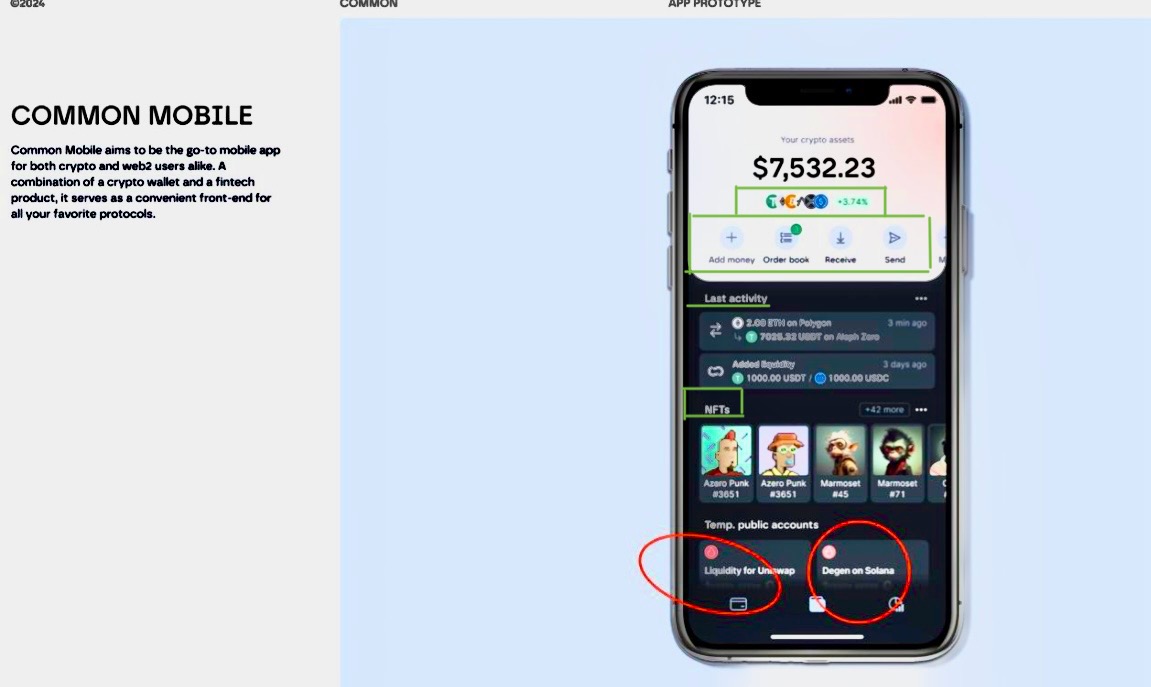
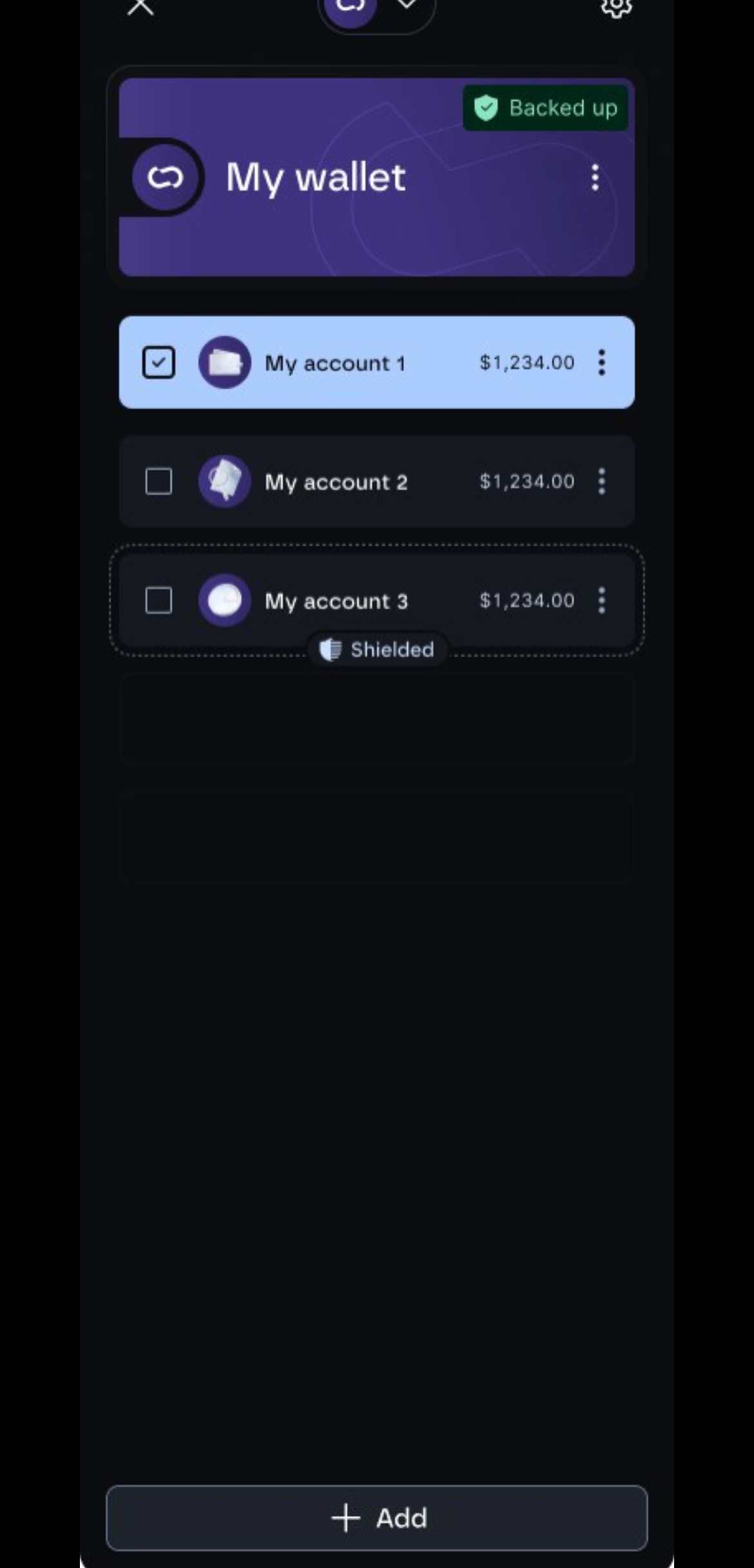
I find the old design, previously featured on the Common App website, especially the green-highlighted points, much better and than the most recent sneak peeks of the Common App. The new sneak peeks resemble the layout of a wallet extension much more than that of a Neon Bank app. It immediately looks much more complicated than the layout app with the green-highlighted points. The menu bar is super important, and itwas a lot more handsome than it was in the sneak peeks. There you immediately had the feeling that you were not in touch with the crypto App and much more with a Web 2 app.
Status: Reviewed
Log in to comment and vote
No comments yet
Be the first to share your thoughts.