UI improvements
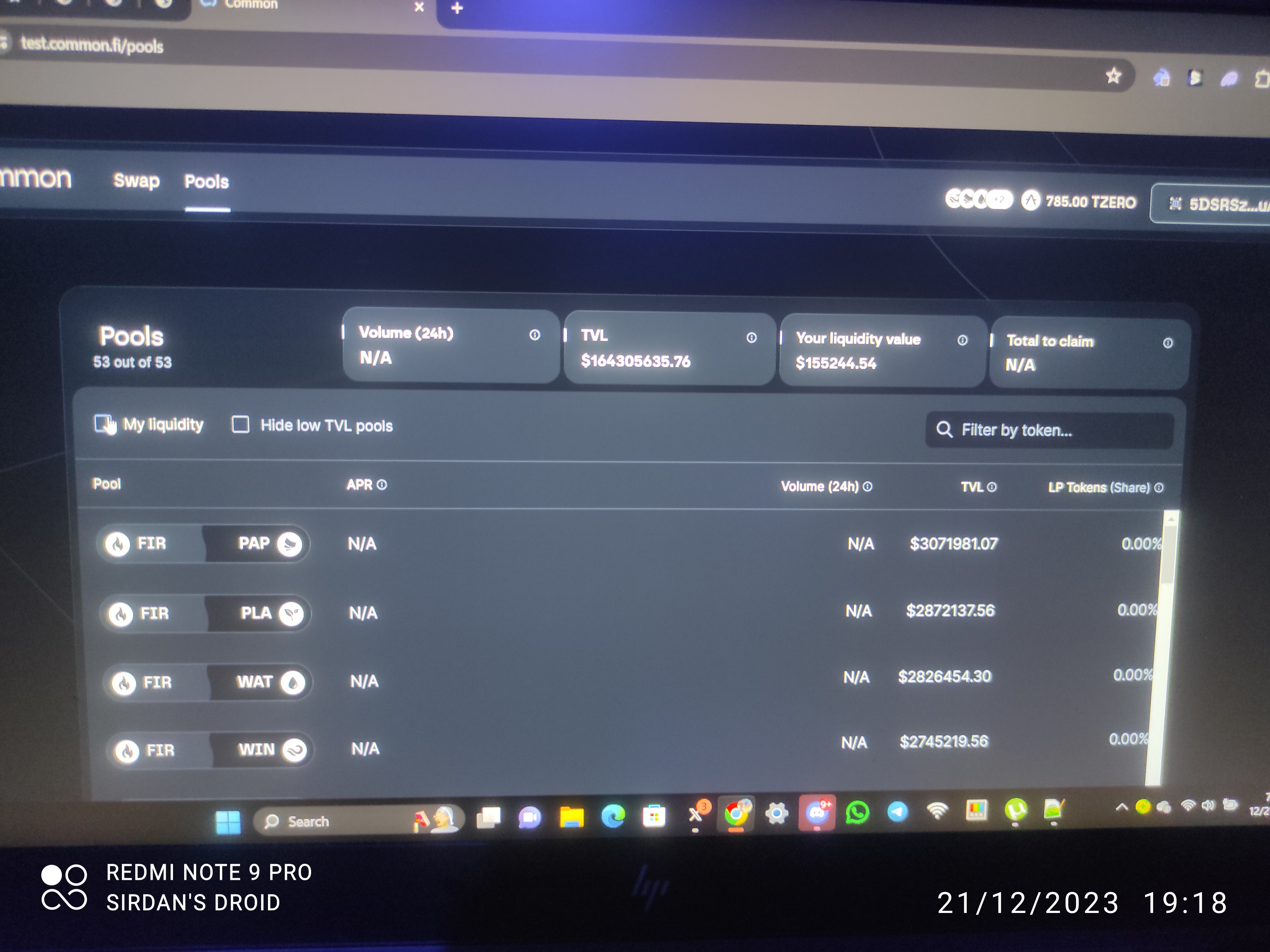
The space between APR and 24h Volume is too wide, tried even on mobile... The details should all be columns and users should be able to shift the columns
Add more filters, e.g by pairs, fire related pairs, paper related pairs, would come in handy when other ecosystems are added. the columns should be able to get toggled, to show from highest TVL to lowest TVL, same goes for LP tokens.
Log in to comment and vote
Comments4
Daniel Ebri
Apr 17, 2024
Yep
Uzomaka Manson
Jan 9, 2024
Nice
wuuuuup
Dec 25, 2023
In the withdraw liquidity section, it would be useful to have a slider in the bar to adjust how much the liquidity a user wants to withdraw. Currently a user has only the choice to click "max" or to enter the (very large) amount manually.
cheers
Wuuuuup
Daniel Ebri
Dec 22, 2023
The header with this important details doesn't get scrolled along on mobile which is perfect, but not so on PC, I have to scroll down to see these details, which ain't right. Make it like mobile.
Balance, wallet address and others shouldn't desappear when users scroll